Monday, April 23, 2012

The albums project....


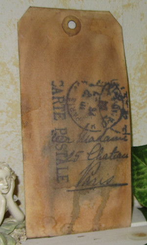
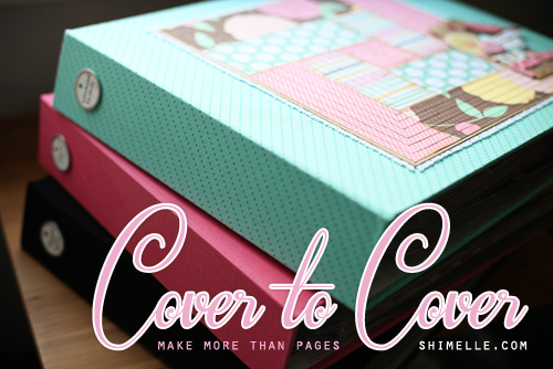
Yep, I've done it again and signed up for some more classes. This particular post will talk about Cover to Cover by Shimelle Laine. The class officially start on May 7th and runs through June 3rd. I signed up through early bird registration during Shimelle's April 13-15 crop. It was taking a little bit of a chance. The class hadn't been officially announced yet. Shimelle gave us just a hint that the class would focus on albums. I decided to go for it. Shimelle does such awesome classes that I figured I would just jump in and go for it. Boy am I glad I did! Already there is great pre-class content posted. This class is going to help me address one of my biggest problems: my scrapbook albums.

Currently, my pages are in a bit of a disarray. I have completed pages in scrapbook storage boxes, some are in albums, some digital pages are just sitting on my hard drive. I have albums that are chronological, and others that are topic/subject driven. Some are labeled, others are not. I have post bound and ring bound albums---an absolute mishmash! I don't scrap in any kind of order really--I prefer it that way. I get burnt out doing chronological based scrapping. This method of scrapping is exactly what has led to my album mess.


As far as albums, I have discovered that I much prefer using ring bound albums. The American Crafts albums are great, although I covet the We R Memory Keepers albums. All of the albums I have purchased in the last year or so have been one of the two. I have easy access to the AC albums and they cost less. These are the ones that I have the most of, although when a coupon and access permits, I will spring for WRM albums in the future.

The funny thing is that my completed pages hardly ever get looked at. It's a combination of things really. The biggest issue is the lack of a true system to my albums. I've worked on this a little and have a very basic foundation that, in the long run will work for me. At present time though, this foundation needs to be adjusted, tweaked, and to some extent overhauled. I mean, what's the point in preserving the memories if the pages/albums just sit there?

My goal in this class is to come out the other side with organized albums that are easy to add to, look at, enjoy, and keep organized. In addition, I want to KNOW what I've already scrapped and where the holes are that need to be filled. I don't want boxes of photos and digital folders of unprinted photos---I want albums full of pages that showcase the photos with words that tell the stories.

Thursday, April 19, 2012

Custom Foam Stamps

I am taking my Creative Chemistry 101 lessons and applying them during Studio L3's Compendium of Curiosities V2 Challenge. This is a series of weekly challenges that will explore the techniques presented in Tim Holtz's second book.

First up is the custom foam technique presented on page 66 of the book. I created my stamps using Tim's Tattered Florals die. I put my new stamps to use with some acrylic paint and Dylusion's spray ink to create this layout:


kiki_web

This first week of the challenge is sponsored by Simon Says Stamp

Friday, April 13, 2012

Using what you have...

There are so many options available in the scrapbooking world. It is really easy to spend a lot of money getting the latest and greatest gadgets, tools, embellishments and so on. Of course, once you acquire all of this, you might find that you build a tremendous stash. It doesn't have to be this way. You what you have--all of those punches, dies, and older die cuts can be used together to create custom embellishments for any card or layout. Investigate your kitchen--you can use foil instead of specialty foil paper. Cookie cutters, sponges, even potatoes can be used for stamping. Invade the office for staples, post it notes, paper clips, markers, file labels, sharpie pens, even rubber bands--all of these items can be used to embellish or add texture to any project. Oh, and what about your household tool cabinet? The possibilities there are endless.

In the following layout, I was completing a challenges to use opposing colors on a color wheel. When I placed my orange cardstock, it was just too plain. Off to the laundry room I went and found a cap from a detergent bottle. It worked perfectly as a stamp to add some oomph without competing with the business of the printed paper.


This next page was created with office supplies (with the exception of the 12x12 base). I used some crayola markers and water (relying on Creative Chemistry techniques), book paper and graph paper to create embellishments and papers. It was just fun to play and create. I like this page--it may not be polished with manufactured scrapbooking-intended stuff, but it still captures a memory and shares a story.


Thursday, April 12, 2012

Thinking of You card

Thinking of You card by crystals622
Thinking of You card, a photo by crystals622 on Flickr.

I used the paint dabber resist technique as well as perfect distress with this card. I'm fairly pleased with the end product, but card making is not my strength. Hopefully time and practice will improve my skill (or current lack thereof).

Perfect Splatter Distress

Perfect Splatter Distress by crystals622
Perfect Splatter Distress, a photo by crystals622 on Flickr.

Yuck! This tag went through a ton of ugly---and stayed there. My Perfect Pearls stayed in lumps and all attempts to make it spread a little---well worked as I added layers, but did not touch that first lumpy layer. I suppose that I'm just not a wrinkle free distress based technique kind of girl. (I swear that this tag is a bit less hideous in person)

Rock Candy Distress Stickles

I love the vintage and shimmery result of this technique.

Note to self: Shabby Shutters doesn't show up really well on manilla tags.

Perfect-ly Distress-ing

Perfect Distress by crystals622
Perfect Distress, a photo by crystals622 on Flickr.

This technique--not my forte. Using the stain to color my background is not my best skill. In the end though, this tag does illustrate the technique so I guess that I passed this assignment.

Perfect Distress Attempt one

If you add too much water and wait too long, ink runs everywhere. It's a cool technique, but not one I think that I will will use often. I'm not great at using Distress Stains. I really have to practice with them.

Perfect Distress Mist

Perfect Distress Mist by crystals622
Perfect Distress Mist, a photo by crystals622 on Flickr.

Yet another tag that went through a lot of ugly until I stopped here. I ended up with a good bit of texture and shimmer in the long run. I can tell you this though, it looks much better in person.

Paint dabber resist

Paint dabber resist by crystals622
Paint dabber resist, a photo by crystals622 on Flickr.

I did this technique right on the tag instead of using glossy paper. I really hated how it was looking at first. I just kept adding ink and water. in the end, I love the result.

Lesson learned: If you don't like the results with Distress ink, just keep adding more and playing. It could turn into something you like in the end.

Rusted enamel

Rusted enamel by crystals622
Rusted enamel, a photo by crystals622 on Flickr.

I totally adore this technique. It is very easy and creates a stunningly realistic enameled effect. It is tough to photograph in a way that does it justice.

Nostalgic Batik

Nostalgic Batik by crystals622
Nostalgic Batik, a photo by crystals622 on Flickr.

I chose the wrong stamp to use with this technique. It had just a little too much detail to give a crisp result. It's still a cool technique. I feel like the Worn lipstick is a bit bright for the piece, but the whole point was to have a bright pop on a soft background. From that school of thought, I guess it worked.

Layered Misting Technique

Layered Misting by crystals622
Layered Misting, a photo by crystals622 on Flickr.

This technique creates a very subtle background. I used a Plaid brand stencil as a mask. The green vines were a solid mask that I sprayed and then did a reverse image on the tag. You couldn't really tell what the vines were so I rough sketched an outline with a Pitt Big Brush pen to give them some form. I stenciled the clock face using a Crafter's workshop template.

I love misting--always have.

Watercoloring with Re-inkers

Watercolor with re-inker by crystals622
Watercolor with re-inker, a photo by crystals622 on Flickr.

This one is a bit....funky--not a subtle background at all. I didn't have re-inkers in a large enough variety of colors, so some of my watercoloring was done with the ink pads. I really need to practice this technique and work on my blending skills.

Embossed Reflection Technique

Embossed reflection by crystals622
Embossed reflection, a photo by crystals622 on Flickr.

I am in love with my Reflection stamps. I really like how this tag ended up. I had to add some pearl mist. It wasn't part of the technique, but this tag was screaming for some sparklies. Note to self: I really need to get some stamp cleaner. Cleaning archival off of embossing folders with soap and water doesn't work too well.

Wrinkle Free Distress Technique

Wrinkle Free Distress by crystals622
Wrinkle Free Distress, a photo by crystals622 on Flickr.

This technique is interesting. There's no real predictability in the results that you will achieve. It definitely goes through a lot of ugly before it is finished!

Brushless Watercolor Technique

Brushless Watercolor by crystals622
Brushless Watercolor, a photo by crystals622 on Flickr.

I love how this technique looks using this particular stamp. I couldn't resist adding a little Distress Stickles to the eye of the feather. I am totally liking the textile of the torn watercolor paper.

Blended Spritz & Flick

Blended Spritz & Flick by crystals622
Blended Spritz & Flick, a photo by crystals622 on Flickr.

This technique is lots of fun. What I learned: if you want more subtle drops, mist the tag lightly, allow the ink to react, and then spritz and flick.